Classic timeline view removal on iOS
-
-
-
Same!
I think even right aligning the dates would improve it.
There’s just lots of unnecessary whitespace when you have more than 1 entry a day. It just looks odd.
-
Hello! Thanks for your feedback! The Classic Timeline option was removed to unify the experience across all supported platforms (iOS, Web, Android, Mac) as this option was never available on Web or Android.
Let us know if we can help with anything else!
-
‘Unifying the experience’ should surely involve bringing all features to all users, rather than removing them! I’m returning to the app after some time away and, after 24 hours, I’m already on the support forum looking for explanations for certain quirks! I was tempted to subscribe to premium but I think I’ll leave it based on what I’m seeing.
-
@pauldreeves68087869a4! Thank you for your feedback! We have more details about these changes here: https://dayoneapp.com/guides/release-notes/changes-to-day-one-2024-19/. I will pass along your feedback to the development team.
-
@staff-lilly @staff-james If you’re focusing on unifying the experience when will you be adding the ability to add custom fonts on the Mac app? 🤞 Please don’t take this as an invitation to remove custom fonts from the iOS app 😅
If you want to unify the experience please can you remove the ugly gap on the left we have when there are multiple entries for a day in the list view on iOS:

Mac app:
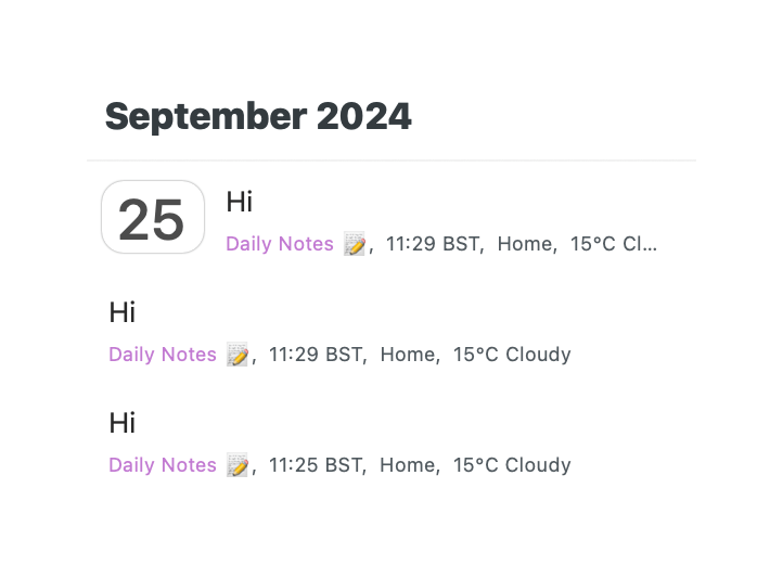
Also I didn’t even realise until I took those screenshots that the colours are different, the time is displayed differently, as is the date, and the month banner is different.
-
@springads That’s great feedback! I will share your comments with our design and development.
